Movable zine, part 4
During the past couple of months I've been working on making a short run of pop-up zines. In part 1 I outlined the tools and materials, part 2 runs through the design of a single page step by step, and part 3 is an exploration of the "print then cut" workflow on Cricut Design Space.
This post is about finding a workflow for adding images to the cut pieces. On the previous post I used some dummy shapes that I quickly doodled on the vector editor, which meant I had a single file that would get imported into Cricut Design Space, as these shapes were also vectors. But my aim is to add other visual elements that come in the form of image files (such as JPG or PNG). So I needed to figure out a way to align the drawings (image files) with the paths for cutting and folding (vector files).
Even though a lot of vector editors can embed images into the vector files Design Space doesn't support this feature so vector files and image files have to be uploaded separately.
Images on a page
When it comes to adding images on a rectangular cut, like a single unfolded page, the process is relatively simple. If the cut is, for example 6 inches by 4 inches, the corresponding image needs to maintain those proportions in pixels so when it comes into Design Space it can be scaled to the appropriate dimensions in inches and then horizontally and vertically aligned to the cut path.
For example if you are cutting a 6 in by 4 in rectangle, the associated image can be 3000 pixels by 2000 pixels.
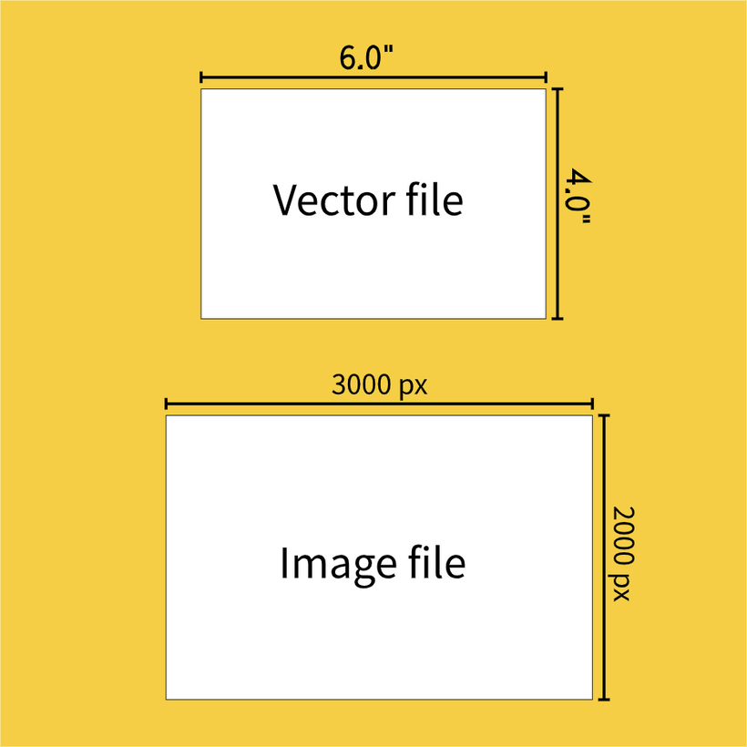
Or in this case any multiple of 3 and 2 really, as you will scale it to the cut dimensions, so 1500px by 1000px would work too, or 6000px by 4000px.
Scaling after the fact is better than trying to stick to the default pixel to inch scaling of Design Space. This is 144 pixels per inch which is a very low resolution (that is: if your PNG file is 144px by 144 px, it will turn into a 1 inch by 1 inch print and cut when it comes into Design Space).
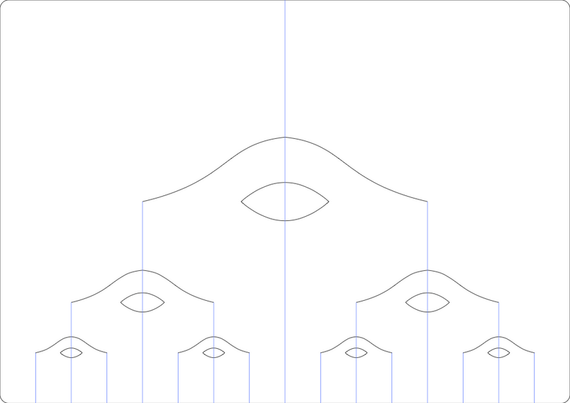
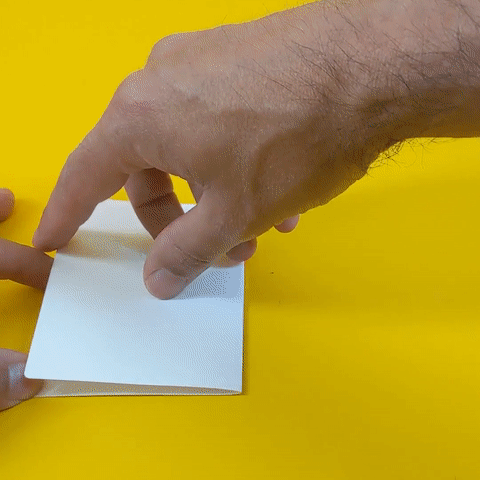
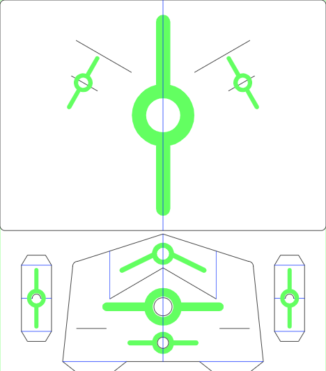
In practice there is a lot of back and forth between software tools. For my first experiments I started with a known cut file, a variation of this shape:
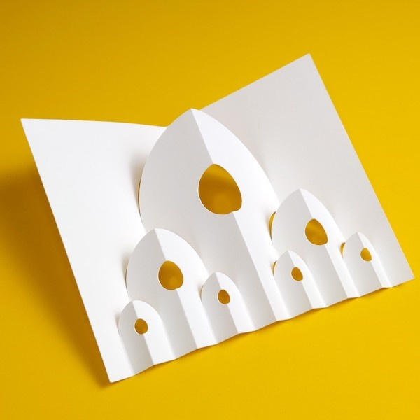
The cut file looked like this (black lines are cuts, blue lines are folds):
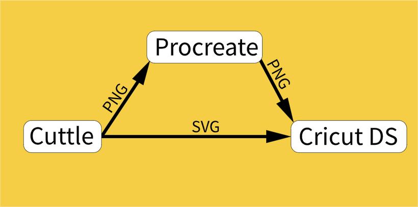
I exported a PNG version of this design from Cuttle (my vector design software of choice) that I used as a guide to create the drawings in Procreate (a well known iPad drawing app), then I exported a PNG from Procreate, uploaded to Cricut Design Space (DS) and scaled it to the right dimensions. Then print it, then cut it.
This is what my first attempt looked like, I was trying to go for the look of the recent zine, but I'll talk more about looks later:
I'd call it a decent try:
It's a little difficult to print on card stock but otherwise the workflow was starting to take shape.
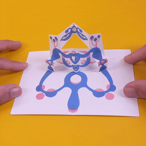
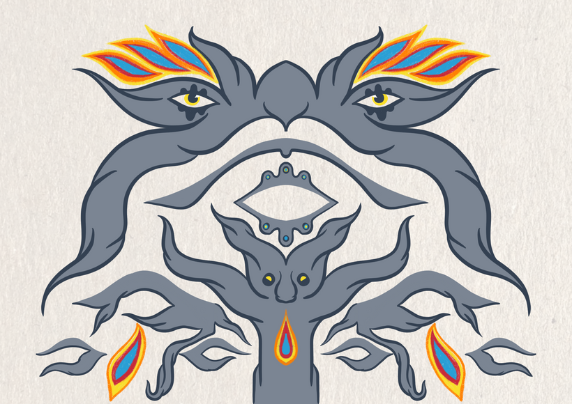
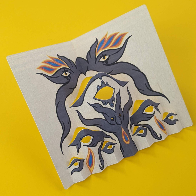
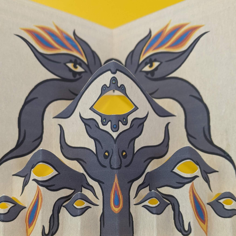
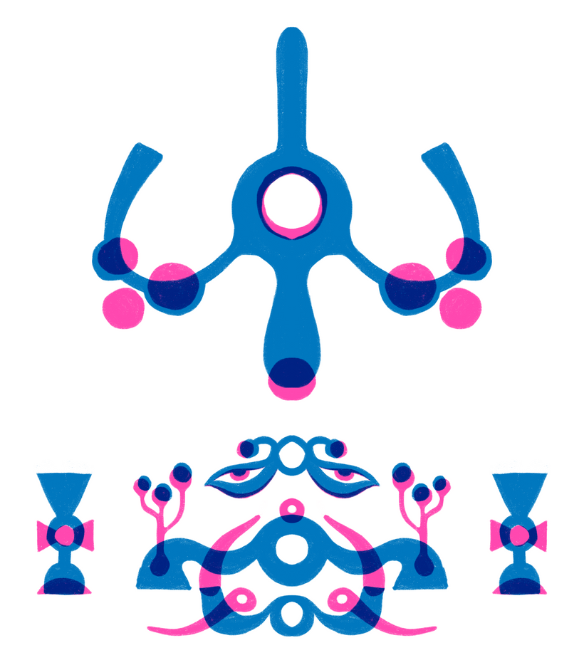
Encouraged by this success I decided to try a more elaborate image on the same cut:
The print again has a lot of flaws, but more importantly, this version made me realize there is a balance to maintain between the drawings and the added complexity of the folds.
In my opinion this version is too complicated and it looks busy when folded.
So this lead me to try a simpler graphic style next.
Multi-part layouts
The workflow for a layout that includes multiple pieces is pretty similar to the single rectangular cut except for a few key considerations: all the pieces must fit inside the usable area I discussed last time (a 9.25 x 6.75 inch rectangle) and the layout in the SVG file needs to stay consistent.
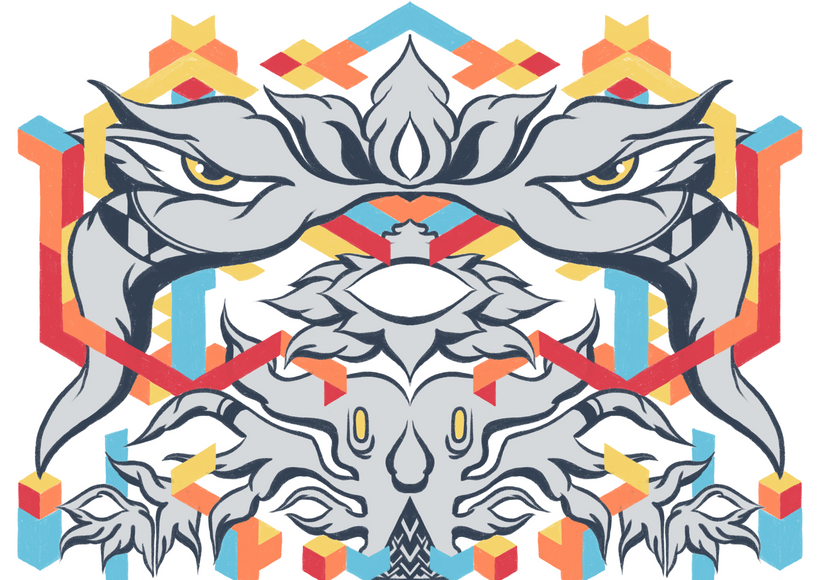
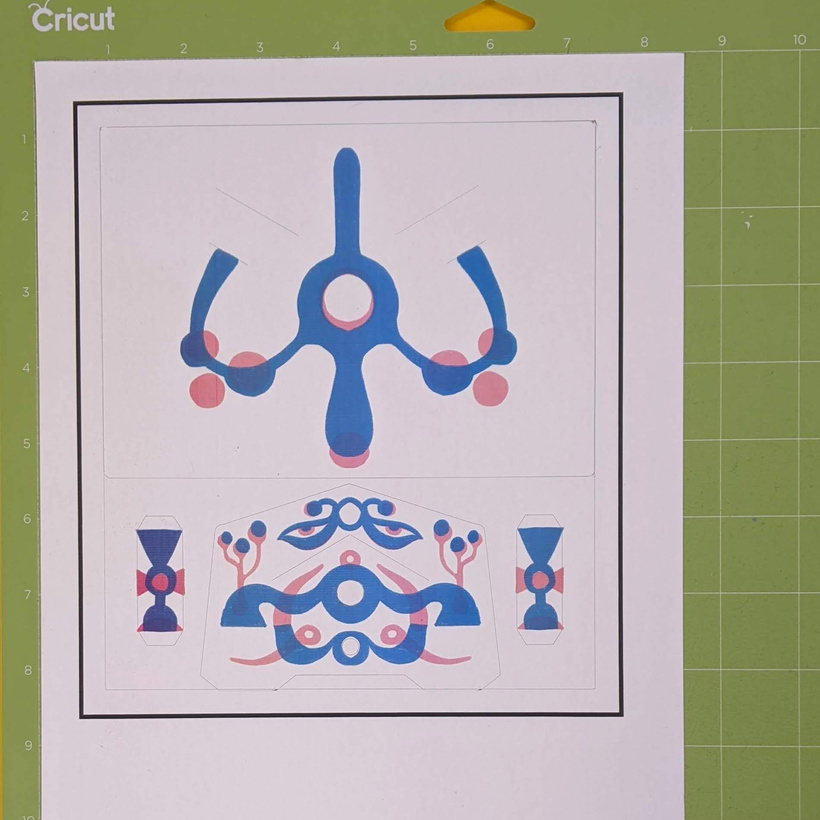
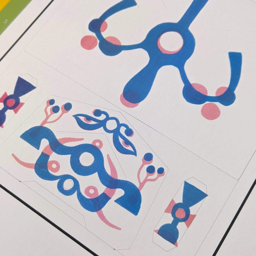
For this example I used one of the previous designs as a reference:
This is what it looks like flat:
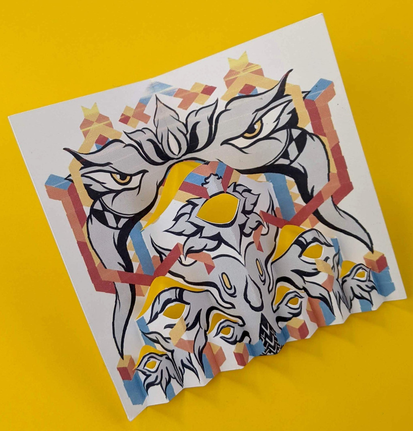
And here is the drawing, I decided to play around with this two color screen-print like style for simplicity:
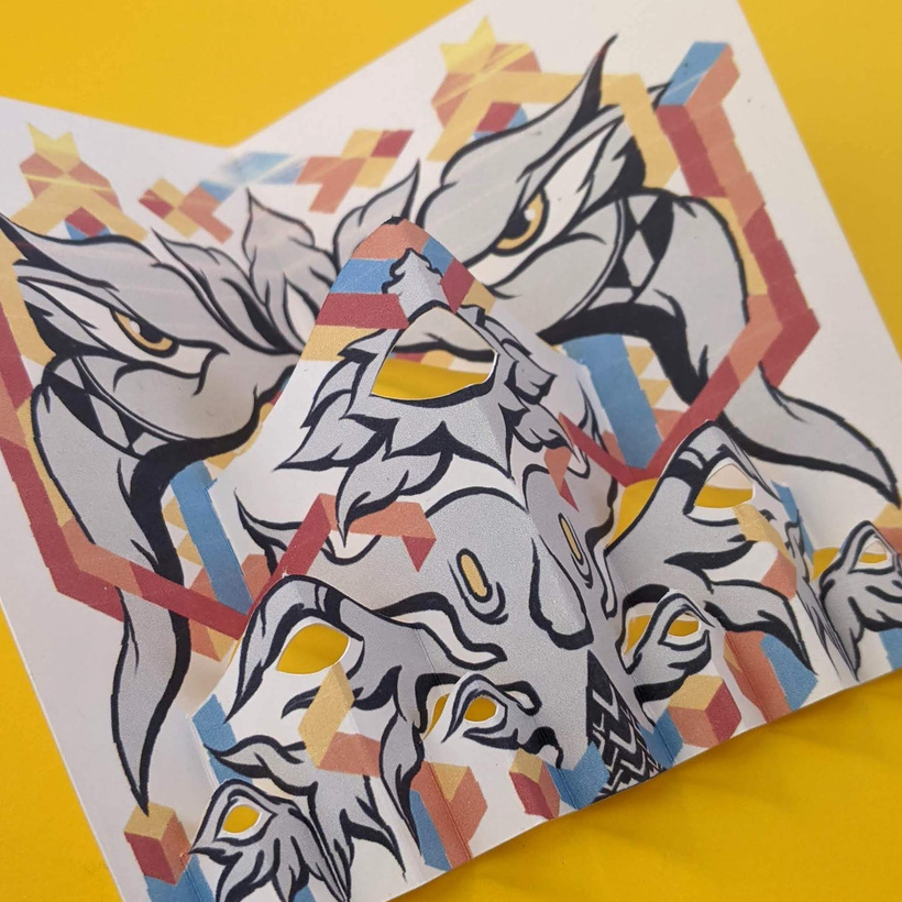
After scoring and cutting:
And after assembly:

One thing I realized with this color scheme is that is hard to get home printers to print decent looking cyan and magenta. Printing on card stock has been another challenge, I think I might try to outsource this.
Initially I had an idea for the graphic style I wanted to aim for, but these printing difficulties and the added complexity of the folds is making me rethink that. In a way I'm trying to find my pop-up voice through this process of trying and failing and learning.
Thank you so much for following along! I hope you are finding this journey interesting.
Best wishes,
Federico.