Movable zine, part 2

I realized my last update was a little text heavy so this time I'm going to show you more progress with images.
My current goal is to make a short run of pop-up zines cut by machines and assembled by hand. To develop a workflow of my own I've been going through The Pop-Up book by Paul Jackson, making digital versions of the techniques outlined, and cutting them on a Cricut Maker.
It's fun to take pictures of these things, they have a pleasant sculptural presence.
And the pictures look much better than the pile of paper I have on my desk :)
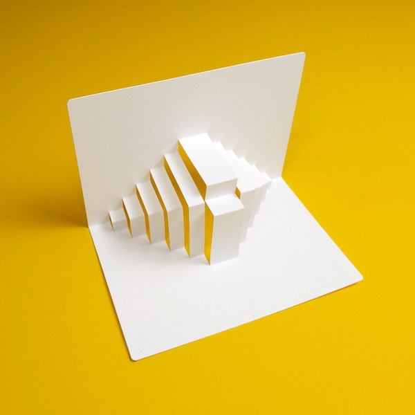
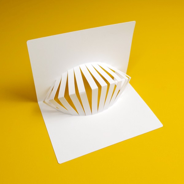
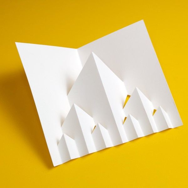
There is one particular technique I've been diving deeper into. In his books Paul Jackson calls this technique "generations", and it consists on doing one pop-up, and then repeating the same operation on the creases created by it, multiple times in a kind of fractal fashion.
This is what it looks like when done on a single piece of card stock:
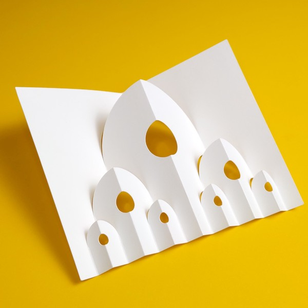
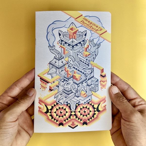
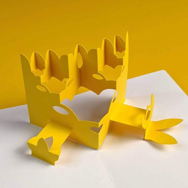
I decided I wanted to design one pop-up page combining the "generations" method with the "horizontal V" method. I took the cover from the recent zine as a sort of goal, or inspiration for the shapes:
And here is the progression of the design in 5 gifs.
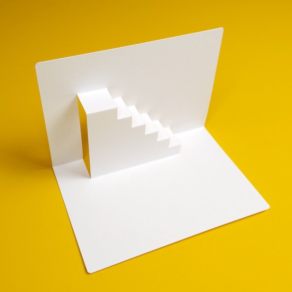
First: make the V
I started by figuring out the angle and a the size of the pop-up (the yellow piece in this case) this is what a basic horizontal V looks like:
Second: add a cut with generations
You can see how the V is transformed by the series of related cuts:
Third: make some eyes:
I added some cut outs for the eyes, simplified the topmost folds and experimented a bit with adding some black lines (drawn with the machine). I don't think I was quite ready for this last step. Also the smallest eyes were too small and didn't cut so well:
Fourth: a mouth and some scenery flats
Here I cut fewer eyes but added other decorative cuts. I also added those little "arms" which take advantage of corner between the yellow pop-up element and the base card. Paul Jackson calls that technique "scenery flats".
Fifth: do something with those scenery flats
On the left I added a cut-out to the "arm" and on the right I simply glued on a new shape.
Closer look:
I think this covers the paper cutting part of this spread. Next I'd like to work on some more (printed) visual elements. I hope you enjoyed seeing the progression of this design.
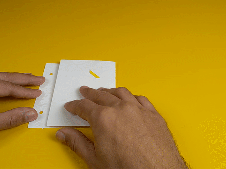
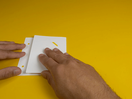
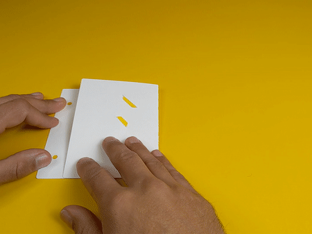
A couple of technical notes: the yellow card stock is 80lb, and the base white card is thicker, 110lb, I found out that scoring the thicker card didn't work as well as cutting a dashed line for making a nice hinge:
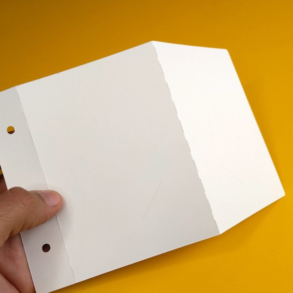
This seems to be a good compromise between the stiffness necessary for the base and the freedom of movement needed for the hinge.
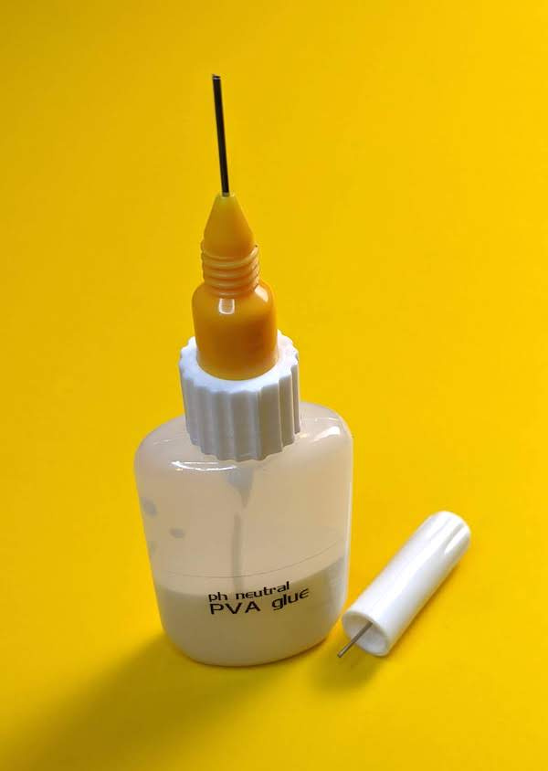
Also on the tools department I found this delightful applicator recommended by a paper artist I follow, it has a fine metal tip and the cap has a plunger that goes into it to prevent it from clogging.
Thank you so much for following along and supporting these paper experiments!
Federico