Movable zine, part 5
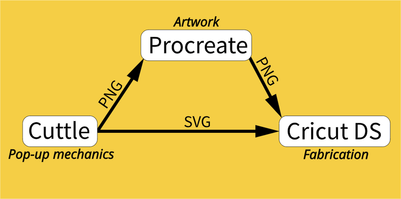
On the previous update I talked about the process of adding illustrations on top of the pop-up mechanism. In short: I use Cuttle.xyz to design the pop-up cuts, I export an image to use use as a guide to make the artwork in Procreate and then combine both in Cricut Design Space for the fabrication.
That's the short version but in reality there is a bit of back and forth between these platforms as I figure out the design.
Printing
I was struggling a bit with printing so I finally got myself a dedicated art printer. Before, I was using my partner's work laser printer and I noticed the ink was flaking at the creases and after some tests I found out inkjet printers do better with this kind of abuse.
Of course with printing there is always a gap between what you see on screen and what you can produce given the printer and the kind of paper that you are using, so this led me down the path of finding a suitable palette.
I don't have a lot of experience printing things so here are some things I've learned recently (which will be pretty obvious to you if you have any printing experience 😅) :
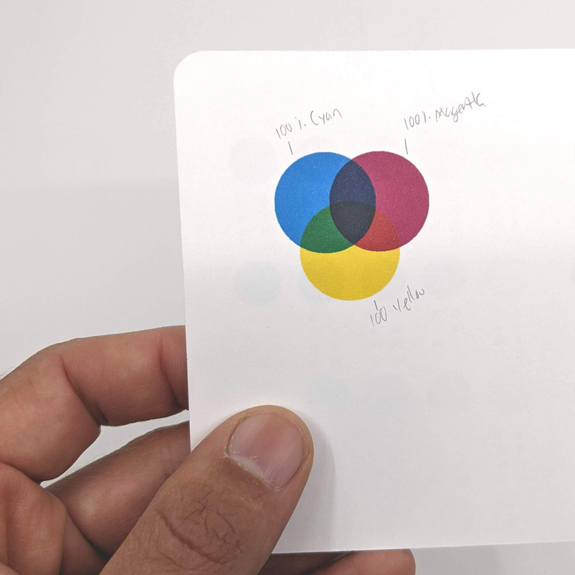
You can set up your documents to CMYK which stands for Cyan, Magenta, Yellow, and Key (black) which are the 4 inks most commonly used in color printing.
The type of paper you use will also determine the brightness of the colors and sharpness of the images (there is a good reason for "photo" paper)
Most blacks are a single ink, but some printers use something called rich black that blends black and color inks for a deeper tone.
This guide that was helpful in my printing experiments, I ended up setting up and printing Procreate documents with their CMYK combinations on the specific card stock I'm using to choose a palette.
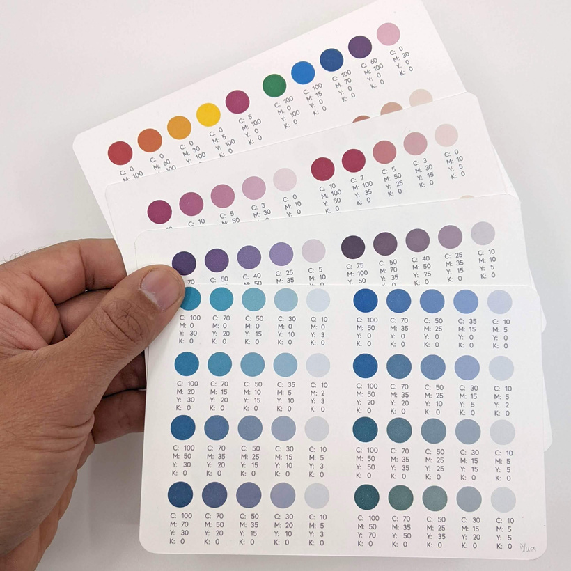
After some testing and printing and experimenting with textures I settled on this palette which is very close to the colors I used on the recent zine but it's now optimized for my printer and the paper I'll be using:
The black and grey are of the "rich" kind and I put some work into finding a bright red and yellow that I liked.
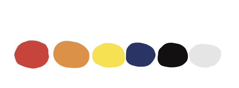
Graphic style
When I tried complex images mixed with folds last time I thought things looked too busy, so I'm striving for a simpler look. I'm trying simple color combinations, a sort of rough colored pencil texture and quick expressive drawings. Easier said than done in my case as I'm really into detailed drawings.
This doodle sums it up:

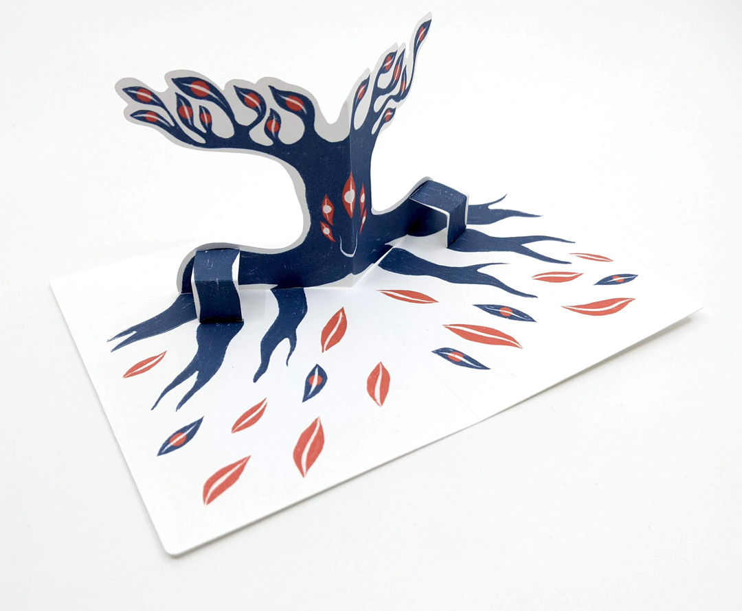
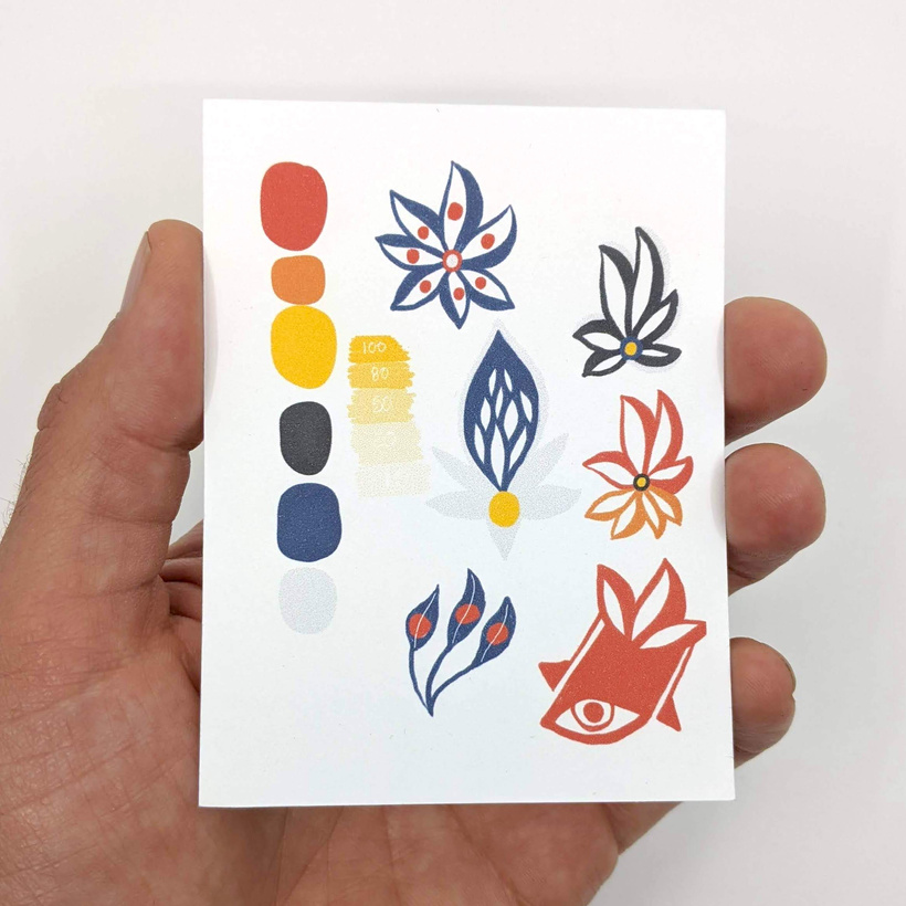
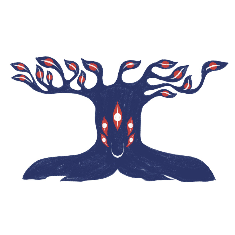
It also became the inspiration for the first spread of the zine, I turned these leaves into a tree:
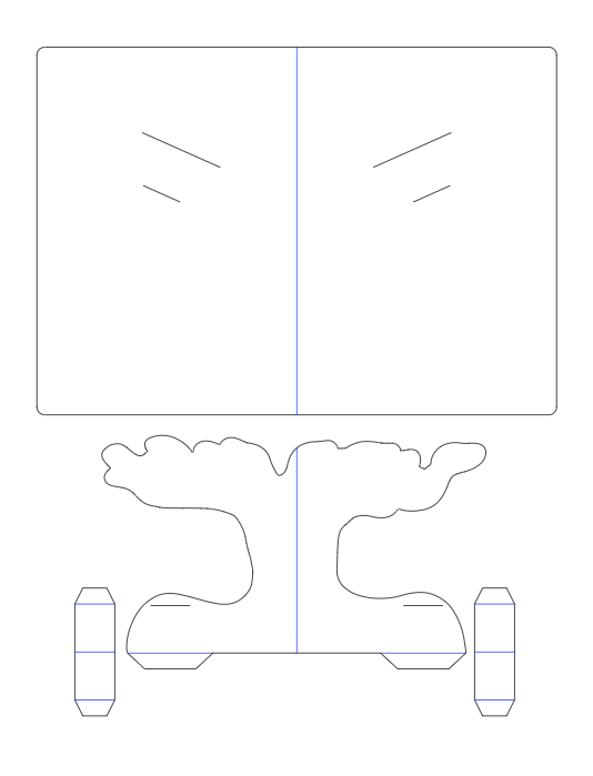
And decided to prop it up on the page using the simple v-fold method. I thought the top outline would be too much to cut so I drew a simplified offset outline:
After designing the basic pop-up shapes in Cuttle I exported the following PNG to serve as a guide to draw the rest of the roots and leaves:
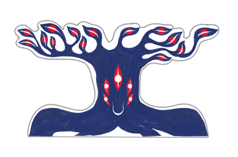
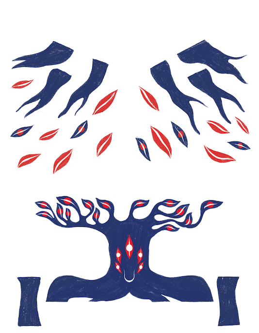
This is what it looks like with the artwork on it:

Thought the actual image that gets into Design space doesn't have the guides:
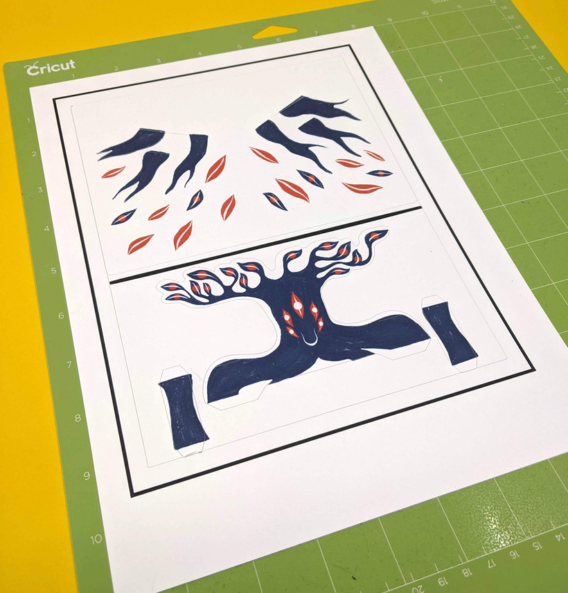
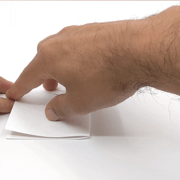
And this is what it looks like after printing, scoring and cutting:
And after assembly:
In some ways it seems like a lot of preparation and testing for arriving at a single pop-up spread for now, but I'm happy with having made all these choices and having a better understanding of the workflow. I'm also into this tree character :)
Hopefully I'll have a couple more spreads for the next update.
Also, would you be interested in having some of these prototypes? If you are into it I'd be happy to ship them to Patrons. Please leave a comment if this sounds interesting
Thanks you as always for following along!
Federico.