24 February 2021
This post was originally published on my Patreon account, please consider supporting my work by becoming a patron.
After the daily drawing marathon of the 100 day project a few months ago I felt like putting more effort into individual images. So this month I started working in earnest on a new zine. I had some ideas that I wanted to execute but the reality is that most things just take shape as you make them.
Sometimes I choose some simple guidelines or principles when starting a project, a sort of mini mission statement. The ones I came up with for this particular zine where the following:
I admire artwork that looks playful, but this is also a reminder to be less perfectionist. Telling myself to be surreal is about embracing weird things, weird subjects and weird compositions. Using words stands in contrast to the last zine I made which was a wordless story. And use more color is perhaps also a reaction to that last zine, which was entirely black and white.
Since I’ve been doing a lot of drawing with heavy outlines I had to spend some time experimenting with ways to add more color to these images. Initially things were looking a lot like a coloring book, which is not a bad look but I wanted something different. I found that if mixed monochromatic images with colorful images I could tell myself a story that would also inform the drawings. Something about monochromatic beings in search of color, perhaps in search of themselves. This character is an example of that:
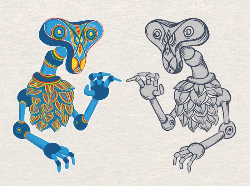
The one on the left has no outlines, and the one on the right has outlines and the kind of shading I tend to do with ink drawings.
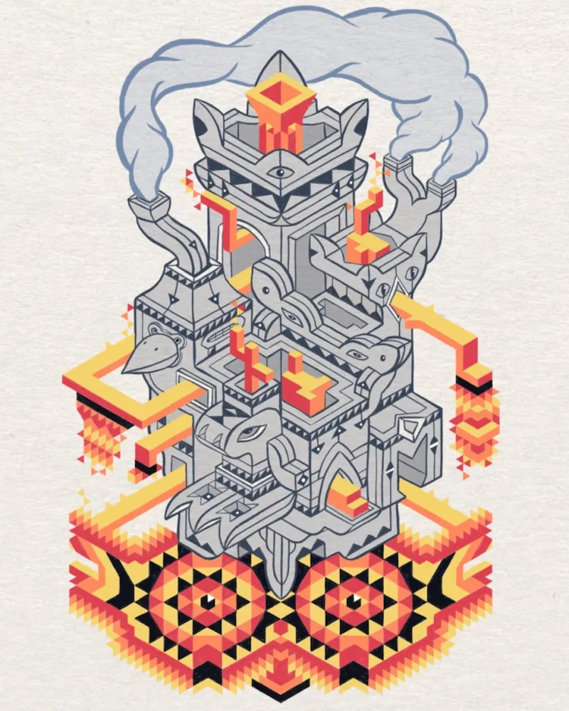
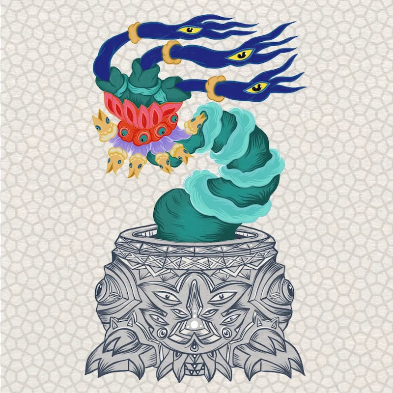
The image at the top of the post is also and example of that idea, a colorful alien plant coming out of a monochromatic pot. And with the one below I was thinking about a colorful vortex emerging from the contact between two beings:
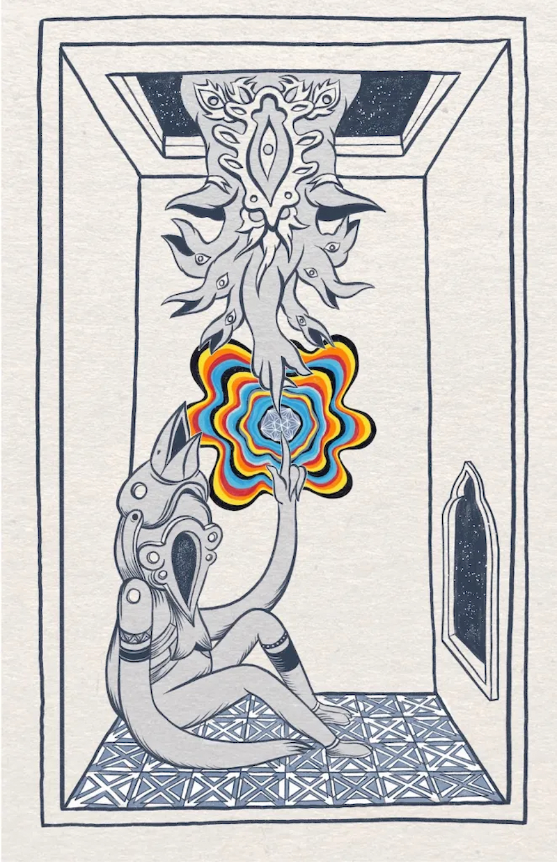
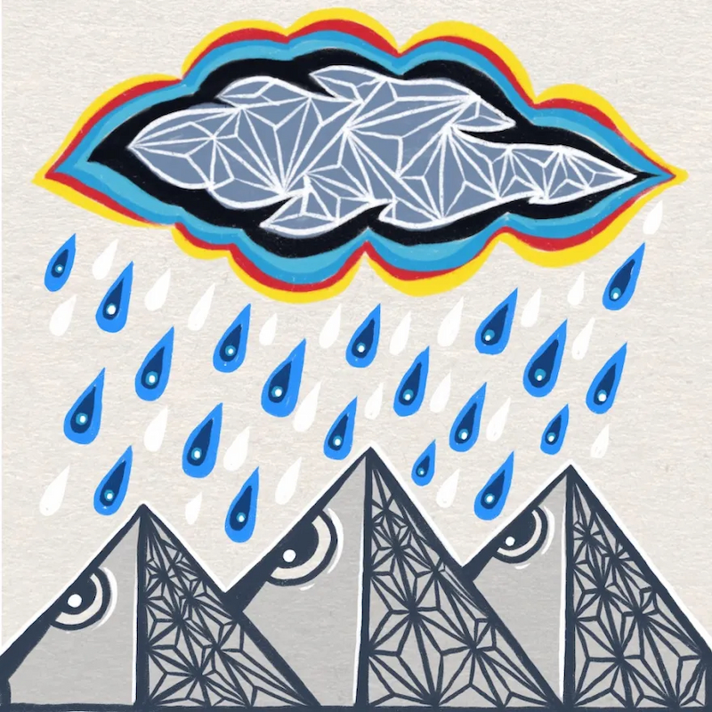
You have probably noticed I enjoy drawing patterns, like the tile floor on the above image. or the triangles on the center of this cloud and the shady side of the mountain:
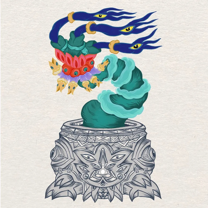
I’m a big fan of decorative patterns but most of the time I prefer drawing them by hand to give them more personality, to give them warmth and an uneven charm. But I think I’ll be breaking that rule with this series. I designed a nice repeat pattern for the background of the plant using digital means and I think it works well. Here is a side by side comparison:
It’s a bit funny to admit I struggle with incorporating digital means to create images when all of these were created using a computer (specifically the app Procreate on an iPad). But this is a big theme for me: I enjoy using computers for making things but I want to resist their aesthetic impositions. Every tool imposes constraints and affects the outcome, a pencil is different from a brush, they are two different ways of thinking and executing images and making marks. And in the same way digital tools are both a way of thinking and doing that influences the outcome, vector images can look square and lifeless, too perfect, but they have practical advantages and even their own charm.
I’m not a fundamentalist of course, but I feel very aware of this kind of code switching, as I’m both a lover of color and black and white, a lover of real paint and simulated screen paint.
The plan now is to work on this zine for one or two more months and then have it printed. I feel like I’m pushing some of my own boundaries and creating some satisfying images. I’ll be posting some shorter more frequent updates as I finish more pages.
As always thank you so much for your support, without it this kind of slower, deeper work would be much harder, plus it’s nice to know I can finance the printing using your generous contributions. I’ll leave you with one last finished page: